A growth strategy can address everything from the product and price, to the company and its audience. Sometimes, this means considering brand development.
BOND Events is a Petersfield-based company that hosts one-to-one meetings. The company, founded over a decade ago, called on Headway Marketing to deliver a strategy for growth.
Many visitors viewed the website on their mobile device, particularly during the events. Although this behaviour is expected, the websites were not responsive and provided a poor experience. Using online tools, it was easy to view what mobile-users experienced and that the logos were not fit for purpose. The Marketing Strategy started with brand development.
Spot the Difference

The company employed the use of a strap line ‘A PROGRESSIVE EVENTS COMPANY’ which was often illegible. The redish colour, known internally as ‘BOND Ginger’ had been a consistent throughout BOND’s existence as had the font.
![]()
Recognising the heritage and integral value behind the BOND imagery, two changes were made: brighten the colour and modernise the font.
The new red, made simply by reducing the quantity of black within the original colour, would become a feature colour throughout marketing collateral.
A recurring theme from the investigation is that BOND is a people orientated company. Whether staff or delegates, BOND values relationships. Headway introduced the concept that photographs used in all collateral should reflect this. Specifically, the brief is ‘Contact’. Any photo should feature contact between at least two people, whether eye contact, physical (shaking hands) or shared with an object (the clinking of Champagne flutes, or one delegate presenting a product).
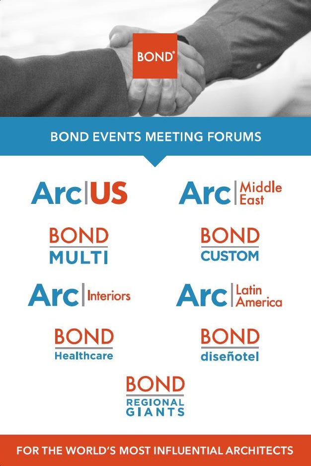
Sub Brand Development
As a part of the brand development, addressing the sub brands was essential.
Some events are prefixed by the title ‘BOND’ as in ‘BONDHealthcare’ and ‘BONDCustom’. Therefore the sub brand logos would read ‘BOND BONDHeathcare’ or ‘BOND BONDCustom’ and include the phrase ‘Meetings Forum’ displayed in different ways.
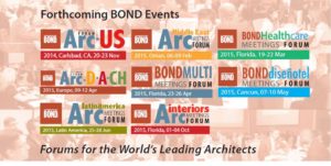
The ‘Event Wall’ was used to promote upcoming events. It demonstrates the variety of fonts, colours and formats used across the portfolio of sub brands.
There was a need to simplify the sub brand imagery. As the names were so well established, the changes needed to purely be aesthetic.
Strong Clear Branding
The output is a logo set that relies on colour in a new way. The field of Architecture and Design is represented by blue, allowing for potential growth into new sectors. The new BOND red replaces the previous use of as many as three different reds within the logos.
The new imagery is striking and transfers effortlessly across the new range of marketing collateral. These assets include a website, emails, event directories, a logged in user area, a video, brochures, banners, table talkers, identity badges and even office walls.